> METHOD <
Bulk’s products are some of the best on the market. Quality ingredients and effective dosing mean customers are often better off if they buy from Bulk.
To explain this we went back to basics to communicate the building blocks of good performance nutrition. The result for Bulk was a flexible ‘nutritional stack’. This graphic device would feature on packaging and across product communications to highlight the benefit of choosing Bulk.
> DESIGN STRUCTURE <
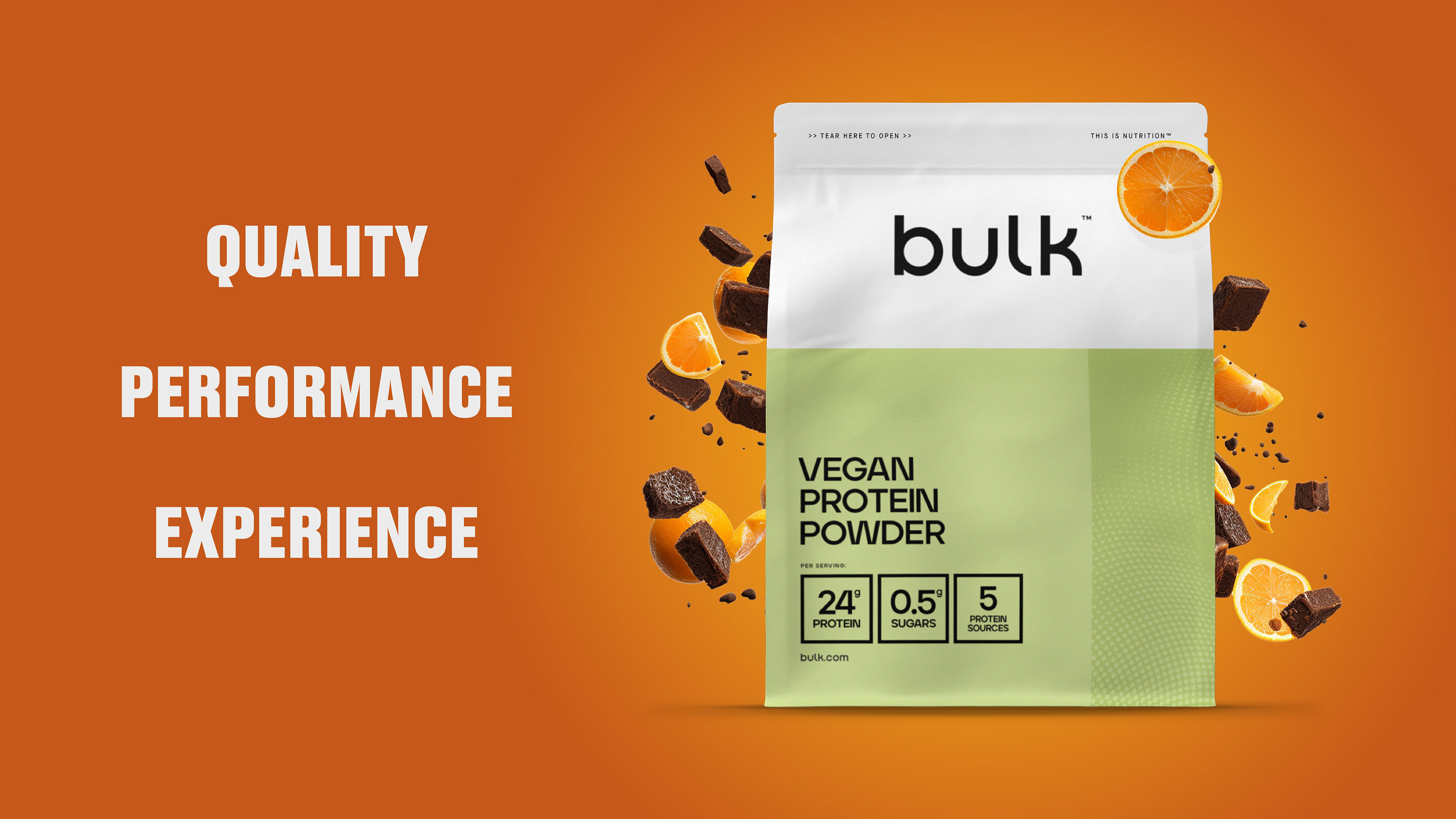
Bulk’s brand is underpinned by three core values: QUALITY . PERFORMANCE . EXPERIENCE
The aim: To create a graphic structure for content that expresses these values, resulting in a design system that could flex across formats and channels.
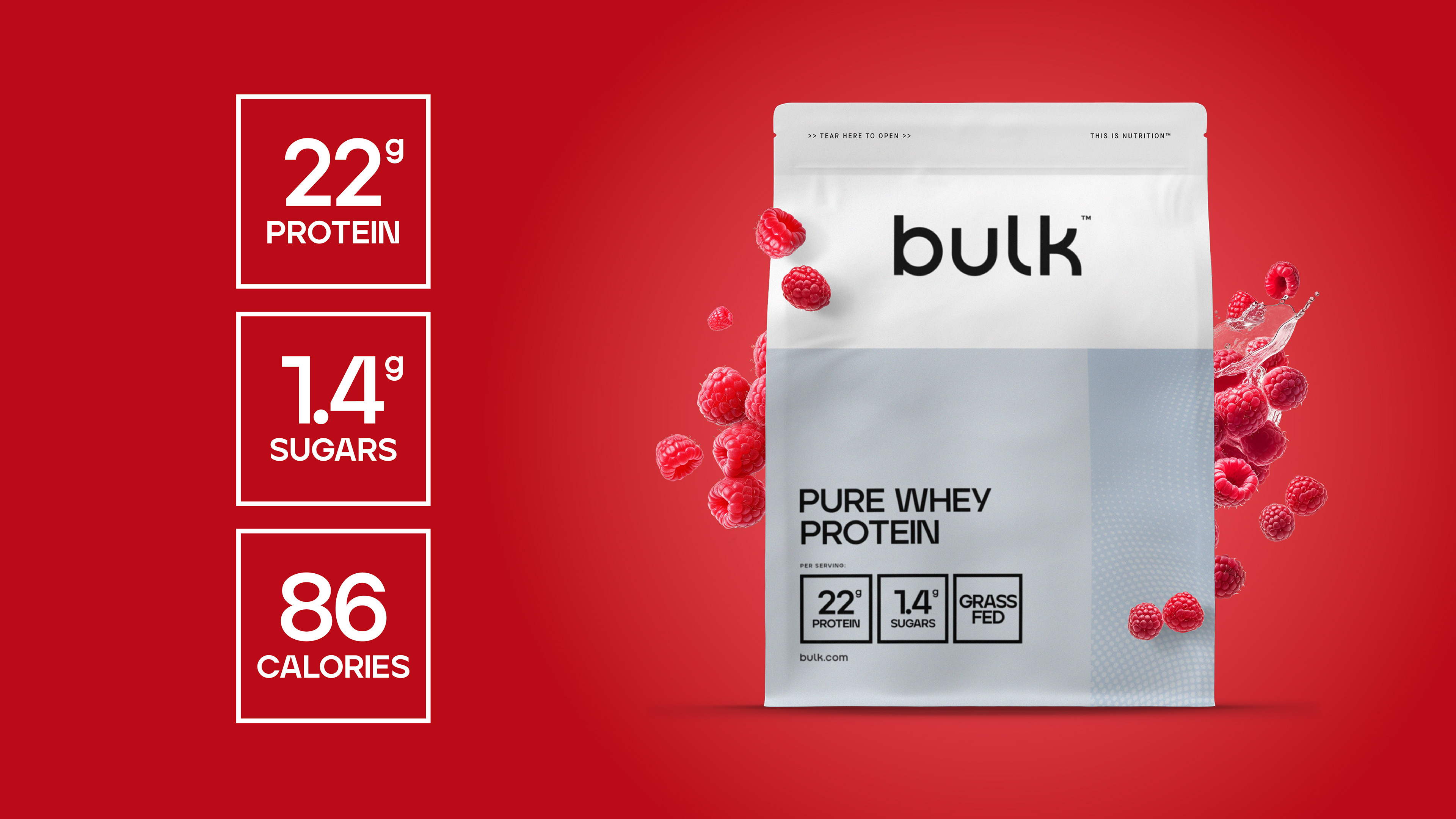
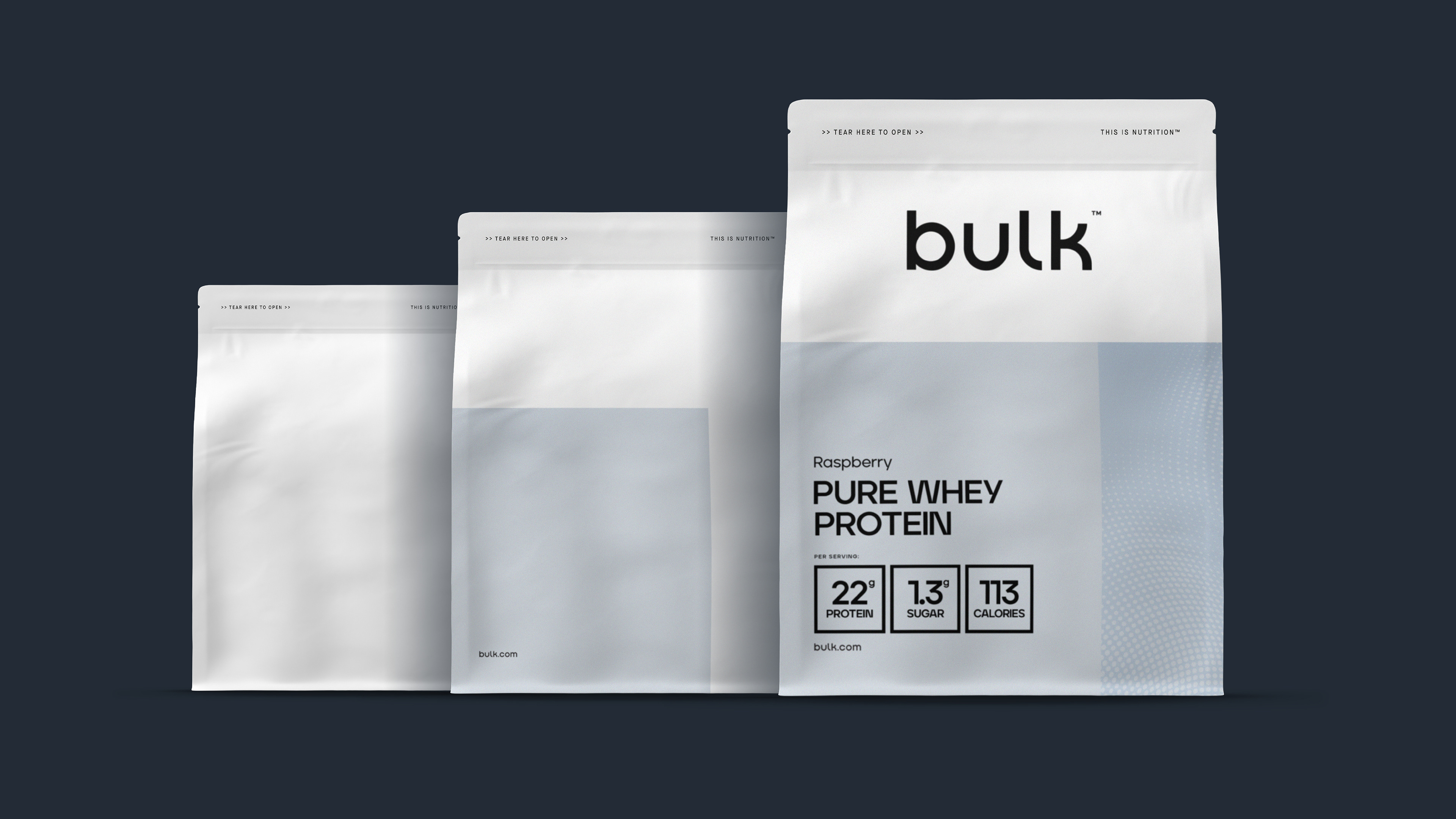
The result: A system called ‘Panels’. The three panels combine to create a visual structure for any product pack format. Well routed to the the Bulk brand whilst being accessible enough to effectively roll out through a small team of artworkers across 360+ product shapes and sizes.
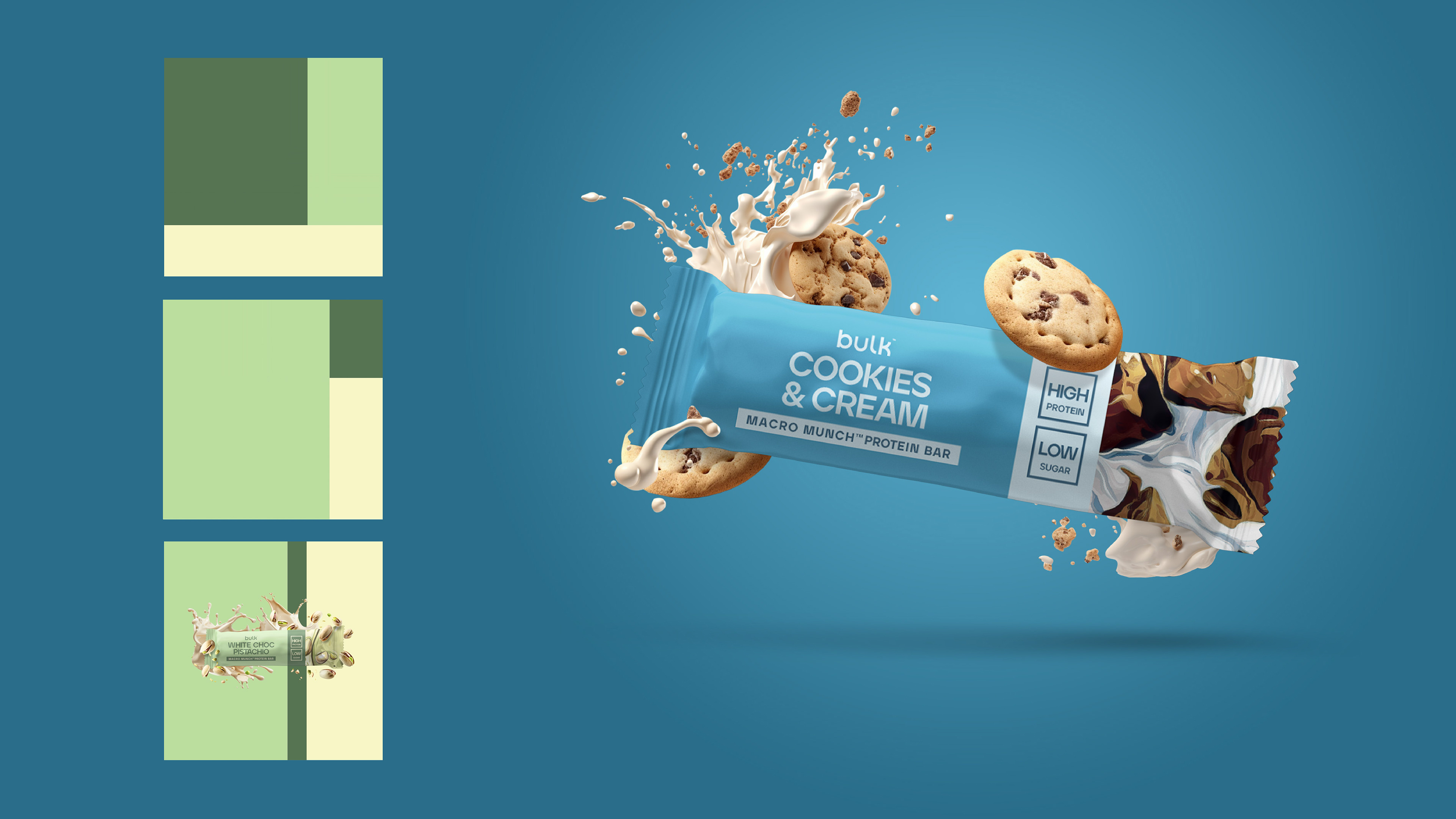
> DESIGN STRUCTURE <
In this example we see how the panels change their arrangement to create the structure for a protein bar.
The arrangement of the messaging on the bar differed from that of the protein pouches. In this format we identified that flavour was most important to the customer, in recognition to this we chose colours, illustrations and messaging hierarchy to guide Bulk’s consumers.
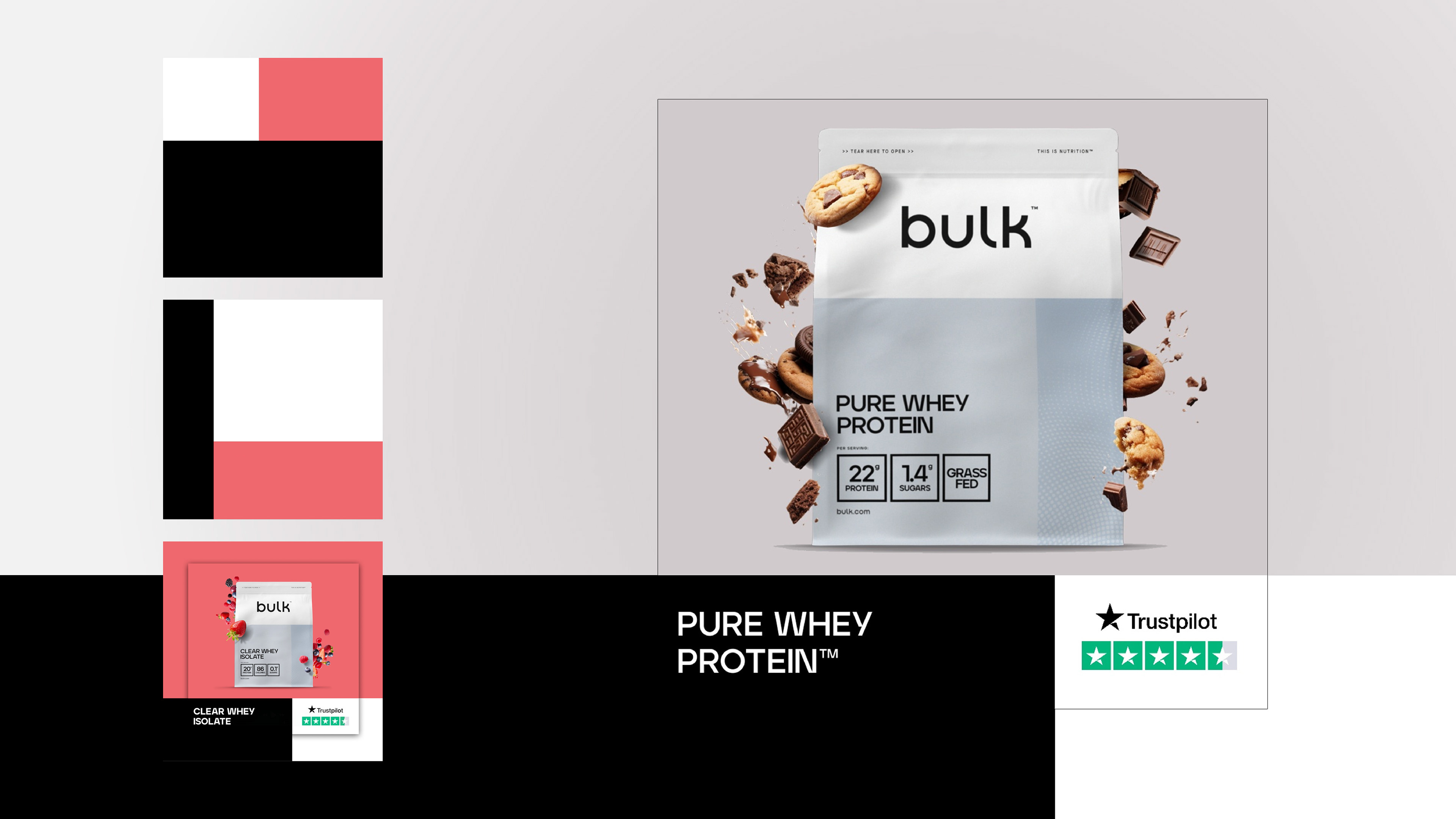
> A MULTI CHANNEL SYSTEM <
The panels design system extended into marketing channels for Bulk’s products, creating a familiar structure for the consumer. This consistency through channels supports the building of trust, recognition and loyalty in the brand, lowering CPA in the longer term.
> LEVERAGING AI <
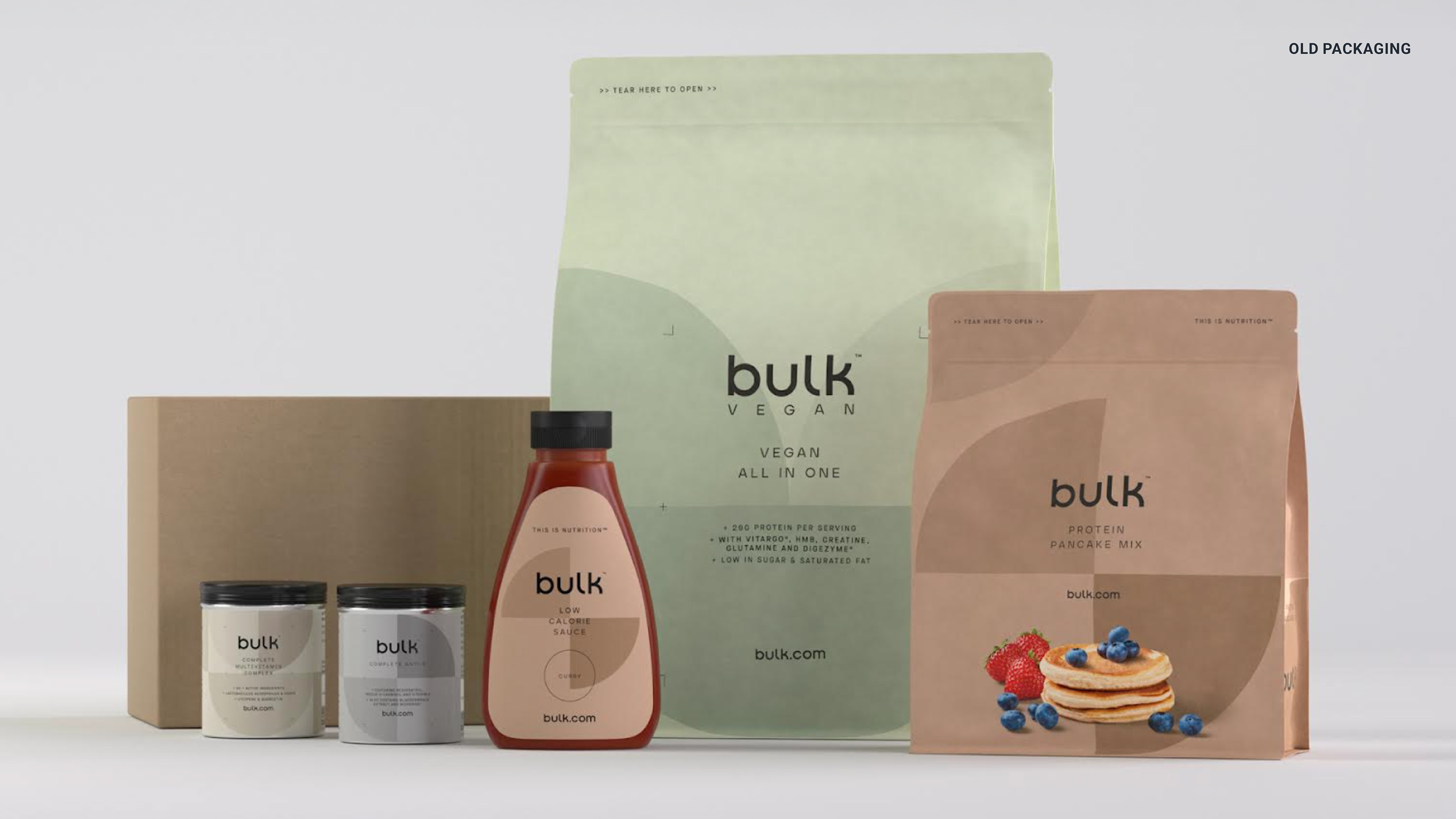
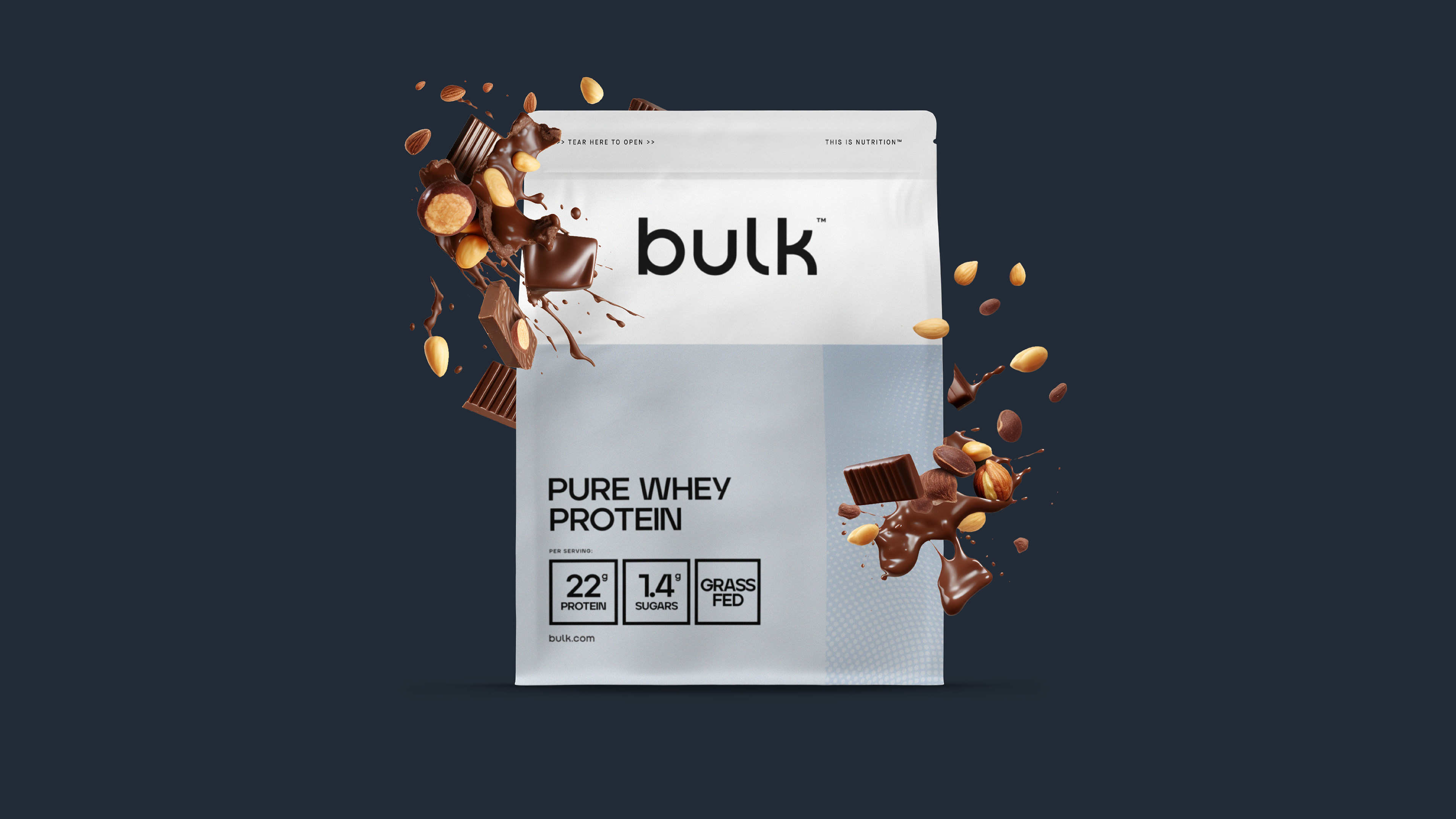
To compliment the packaging design, Bulk needed a cost effective, high quality approach to showing the flavour for each of their 1500 products.
We created a series of Mid Journey prompts that would empower the team to generate imagery depicting the flavour of each product. Using established and understood internal systems designers within the business were able to combine the imagery with packaging renders.
The result was a high quality, low cost flavour descriptor which would feature on Bulk’s website and performance marketing channels.
> COST EFFECTIVE PRODUCTION <
To launch the new packaging in one efficient switch over, we identified that Bulk would need rendered imagery.
Our approach was to create one blank clay render with a Photoshop smart object transformed to fit within a mask. The result was one render to be used for circa 800 SKUs. Increasing performance for the artworking team and dramatically reducing long term cost in render production.
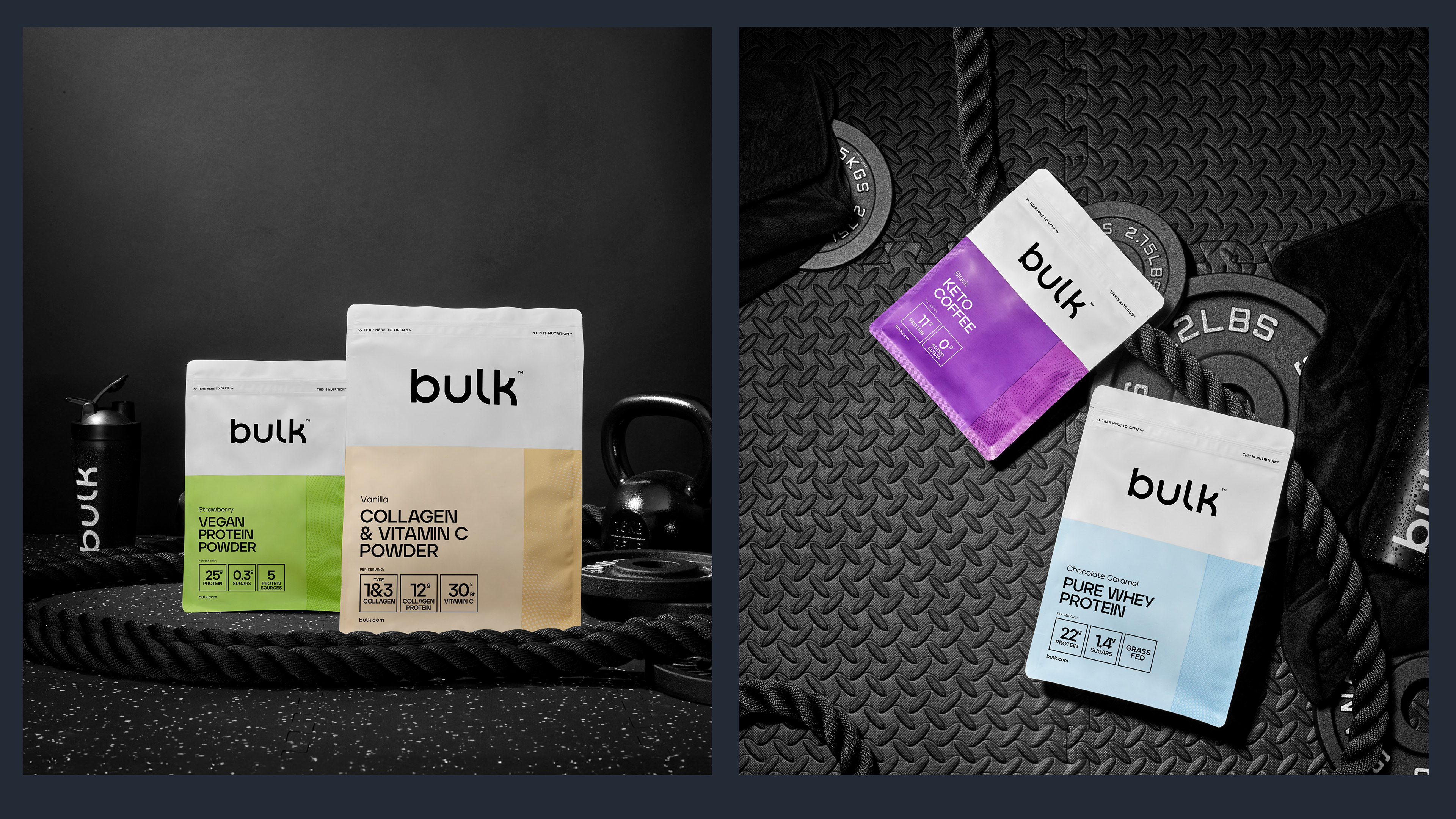
> CONTENT DIRECTION <
To announce the new brand aesthetic and strengthen Bulk’s aspiration to be associated with the world of gym culture, a product shoot with blank pouches was directed. The blank pouches could have the front of pack messaging added in post to allow for specific communications.